
In the past 2 and half months, we have refreshed the visual design of the CFEngine UI (Mission Portal). As part of the UX/UI design team, our goal is to provide an up-to-date design as well as an easy-to-use user interface. In this blog post, I will showcase the changes we made, the process behind the redesign, and the challenges encountered along the way. I am sharing the journey with you and hope to inspire the people who are currently planning to take a similar path.

Kickstart the design system and improve as we go
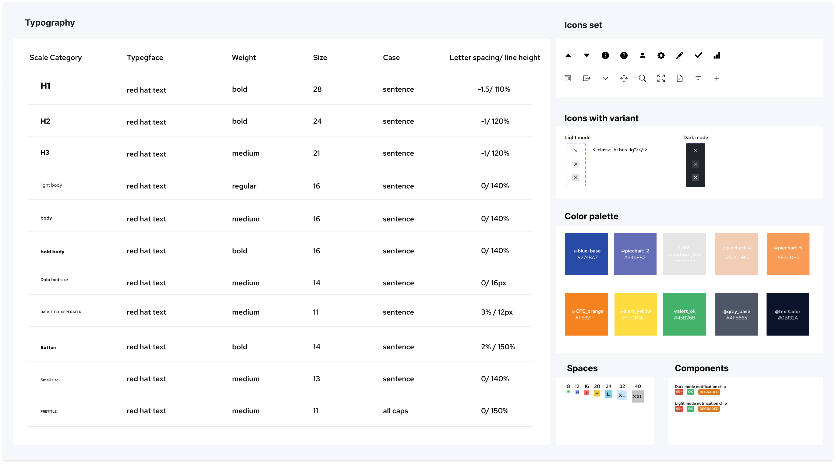
After the launch of the new website in March this year, we knew that updating the look and feel to reflect the website design would be our next project. The first step was to have a similar brand design and identical color set for the Mission Portal. However, I soon realized that the design materials and resources were not enough to start the redesigning tasks. Therefore, I decided to start a design system for the Mission Portal and improve it as we go. For example, if we work on a navigation bar, the components would be documented after creating it and thus we can reuse them afterwards. This effectively saves time on the actual design work and also gives us a systematic overview of the current design assets. Besides, I believe having a design system in place would be worthwhile in the longer-term perspective.
Below is a quick example of our design system. During the process, I also put Legibility & Accessibility into consideration. We chose a new set of colors for the dashboard charts and widgets and made sure the they had enough contrast and reliable readability for all our users.
One iteration at a time
We also decided to focus on improving the UI surface as the starting point for the project. This would enable us to deliver a good amount of value to the user without spending months on design and implementation. With this in mind, I began dividing the design tasks into small and digestible sizes. The reasons behind it are; First, it helps us to make continuous small progress on the project as each task is manageable for each individual designers, second, it allows me to develop the design system step by step.
Top navigation bar
Here we refreshed the look and feel of the menu items and improved the dropdown behavior.

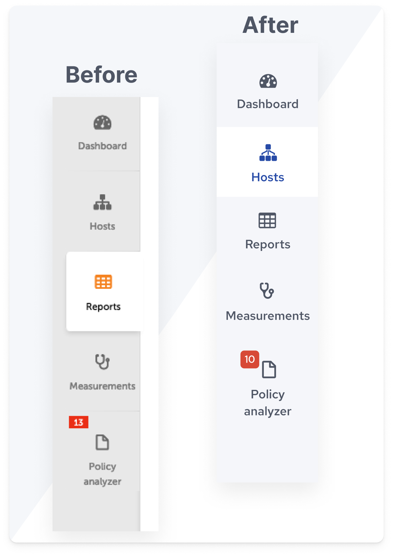
Left navigation bar
For this part, we repainted the colors used for the navigation and redefined the borderline for the session. This gives a fresh look to the interface as well as a better layout transition to other sessions of the page.
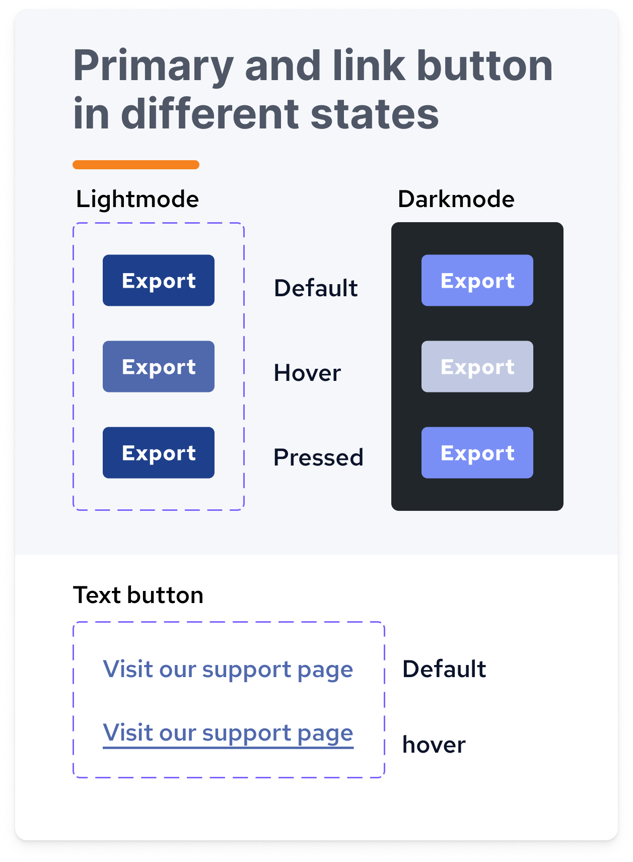
Links and buttons
I defined the primary and secondary buttons together with their different states’ look and feel. The goal is to apply the consistent button looks across the pages.
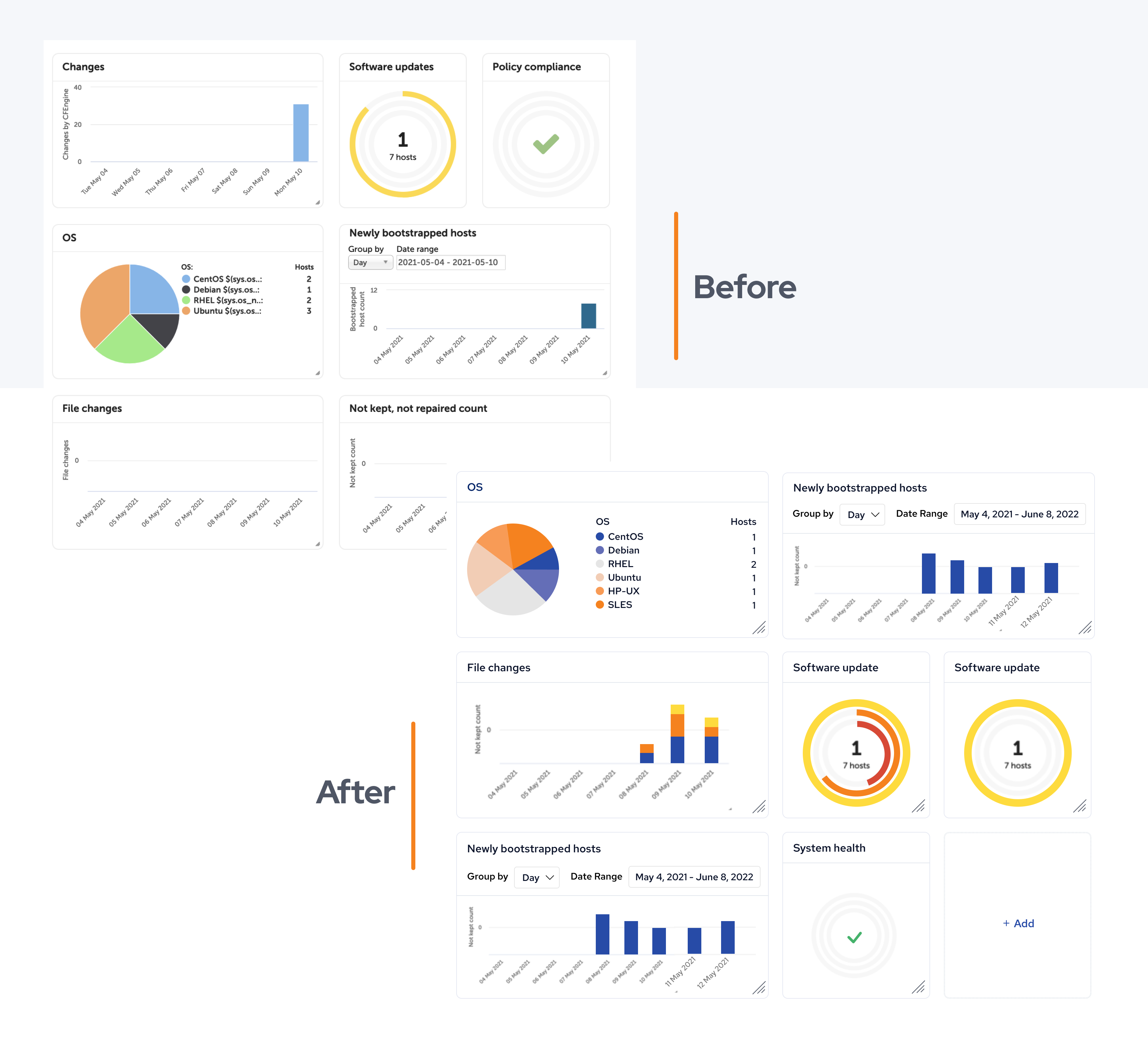
Widgets refreshed
I adopted the new color palette which is color blindness friendly into the widget design to ensure we have good coverage on accessibility and achieve a consistent look and feel of the dashboard page.
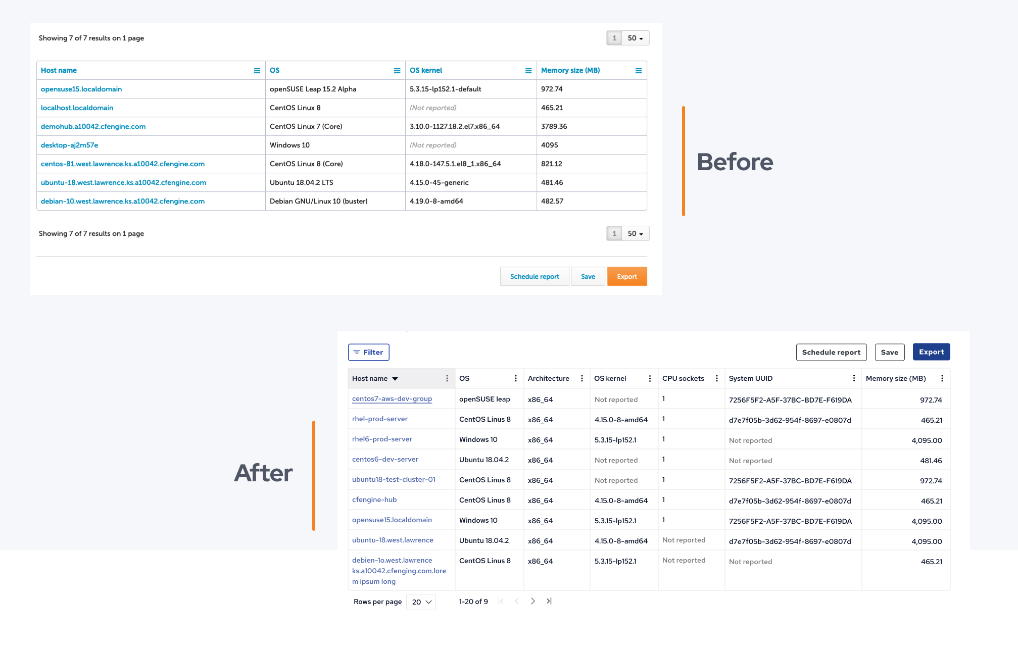
Tables in Inventory reports
The Tables were redesigned, improving the buttons, colors, borders, and text within. They are now easier to read and the primary buttons are relocated to the top of the page so the user can easily access them.
Continued iteration and improvement
We decided to improve the user interface in several stages. By doing this, we can quickly deliver the first set of changes, providing immediate value to our users, and gradually and persistently improve the product and provide our users with a satisfying user experience. This approach also comes with a downside: if we apply changes to one page it will not be consistent with the remaining “old” design. However, the advantages of this approach outweigh the drawbacks, which is why we decided to go down this path.
What’s next?
We are planning more improvements for our web UI as well as continuing to optimize the user experience of the software. You can help us to improve by giving us your feedback. Please tell us your ideas, thoughts, and feedback in the community discussion HERE.
I hope you enjoy the new look of Mission Portal :)
Note: Many of these changes will be in the upcoming 3.18.0 release, but we will continue working on our UI, and making improvements in subsequent releases as well. If you want to test the latest changes, nightly builds are available; See this video, to learn how to run CFEngine nightly builds locally.


